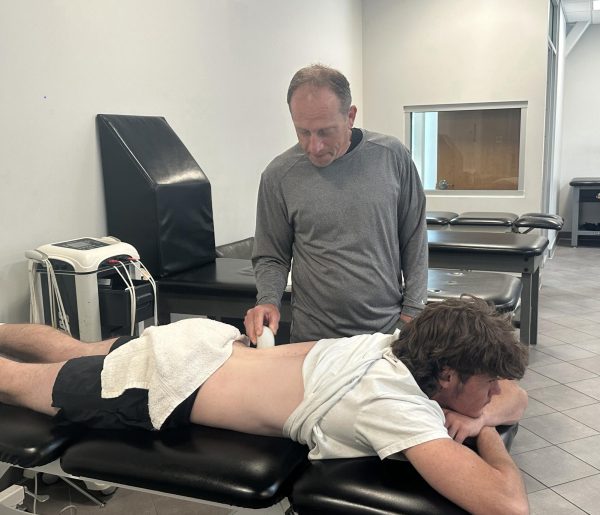
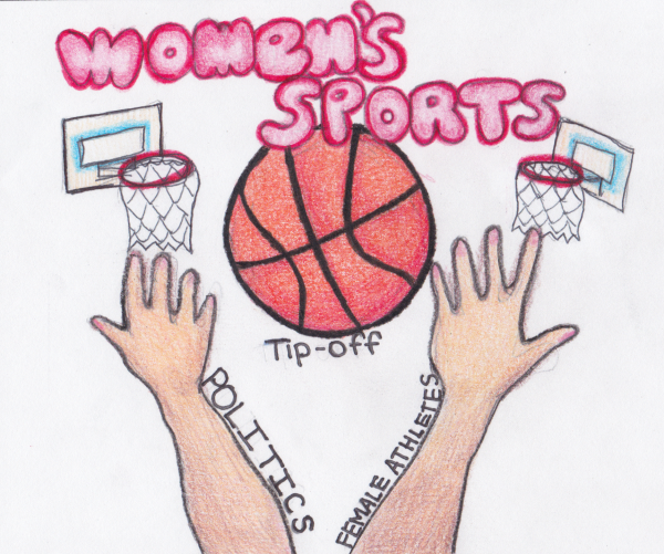
Athletics Logo gets an update
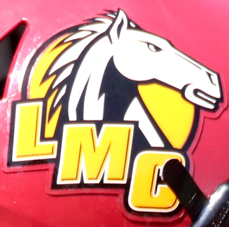
LMC new logo on helmet. Sept 5, 2015. LMC #45 Corey Myles.
“My first reaction was My Little Pony,” said Los Medanos College Vice President Kevin Horan during the Opening Day event held last month before the start of the semester when talking about the athletics department logo he saw plastered in the middle of the gym. A new insignia, created by LMC Media Design Specialist John Schall, was unveiled that same day.
The process of creating the new logo, which was commissioned by Horan, was a collective effort from the Athletics Department, Bookstore, Student Services and Marketing Department. The idea of rebranding came as a result of the gym renovation project, which will start next summer, slated for an Aug. 1, 2016 completion according to Horan.
A lack of continuity among the various Mustangs emblems worn by the teams or just generally displayed around campus, was also a key in the decision to rethink the look.
“We determined we needed to create a more consistent brand among all of the athletic teams,” said Horan.
Every sports team will feature the updated emblem in some capacity on their game day garb. Renovations to the football field and scoreboards are also in the plans.
“Each of the teams are on a schedule for uniform replacement. The new logo will be incorporated as they update their uniforms,” said Horan. “Eventually, the football field will need to have the artificial turf replaced. When it does, we will incorporate the new logo. The same holds true for all the scoreboards.”
Horan also added that the update process would have no additional expense to the college as they “are not replacing anything outside of its regular replacement cycle.”
Schall exercised many resources when it came to help with conceptualizing the logo, including Angelica Gutierrez, a marketing intern at the time that helped with research, Drama Department Chair Nick Garcia, student Anthony Barrett and Art Instructor Lucy Snow’s Art 5 class.
Gutierrez and Schall were invited to speak at Snow’s class about the process of coming up with the logo, which sparked a class discussion that elicited an overwhelming response from the students that the previous logo was not aggressive enough and needed to better represent the competitiveness of the athletes.
“After spending a lot of time working with the old logo and not being totally happy with where it was going, Garcia became involved and helped conceptualize different design options,” said Schall. “Barrett drew the horse concepts of how a more aggressive mustang should look.”
The final fiercer-looking horse head was then born. Afterward, Schall created the stylized bold typography for the emblem.
The initial reaction that Schall has received on the logo has been generally positive.
“The feedback has been great overall. The athletics department is excited to use the new brand,” said Schall. “There have been a few comments of the horse looking a bit too aggressive, but I believe over time, everyone will be proud of the new athletics logo.”
Football head coach Chris Shipe said it took time for him to gain fondness for it.
“When I saw the logo for the first time, I had doubts, but over the last couple months it has grown on me to the point that I really like it,” he said.
Baseball head coach Anthony D’Albora said that he appreciated what having a singular logo does for their department.
“From a coach’s perspective, I think it’s a great idea to have the athletics department on the same page with a new and unified logo. Anytime you can help strengthen a brand and clarify a message, it only stands to benefit the product,” he said.
The bookstore has shirts, hats and other items emblazoned with the new insignia now available for purchase.

Brendan Cross, 22, is a former editor-in-chief and webmaster of The Experience. He is currently the special projects manager.
After graduating from...
I'm very excited to be working on the staff of the Experience. I continue to enjoy my position as a Sports Photographer and Staff Writer...